Adventure Activity Booking System
Website redesign to improve booking and checkout experience.

Website redesign to improve booking and checkout experience.
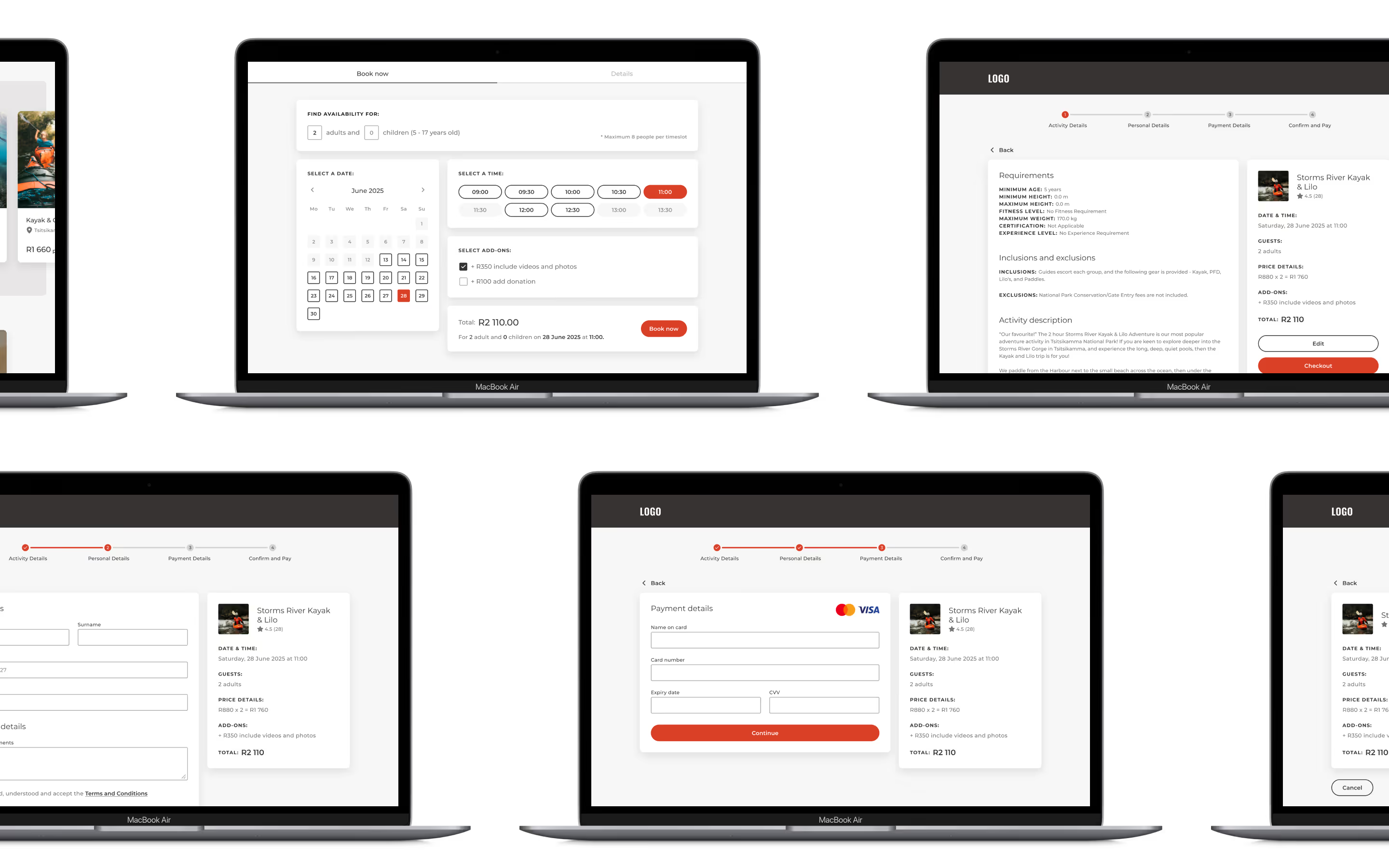
Whilst planning a fun trip for myself and friends, I came across this website that offered amazing adventure activities, but left me confused when trying to book an activity. This inspired me to undertake the personal design project of redesigning the website to improve the booking and checkout experience to reduce booking drop-offs and improve user experience.
I identified three major pain points affecting the overall experience:
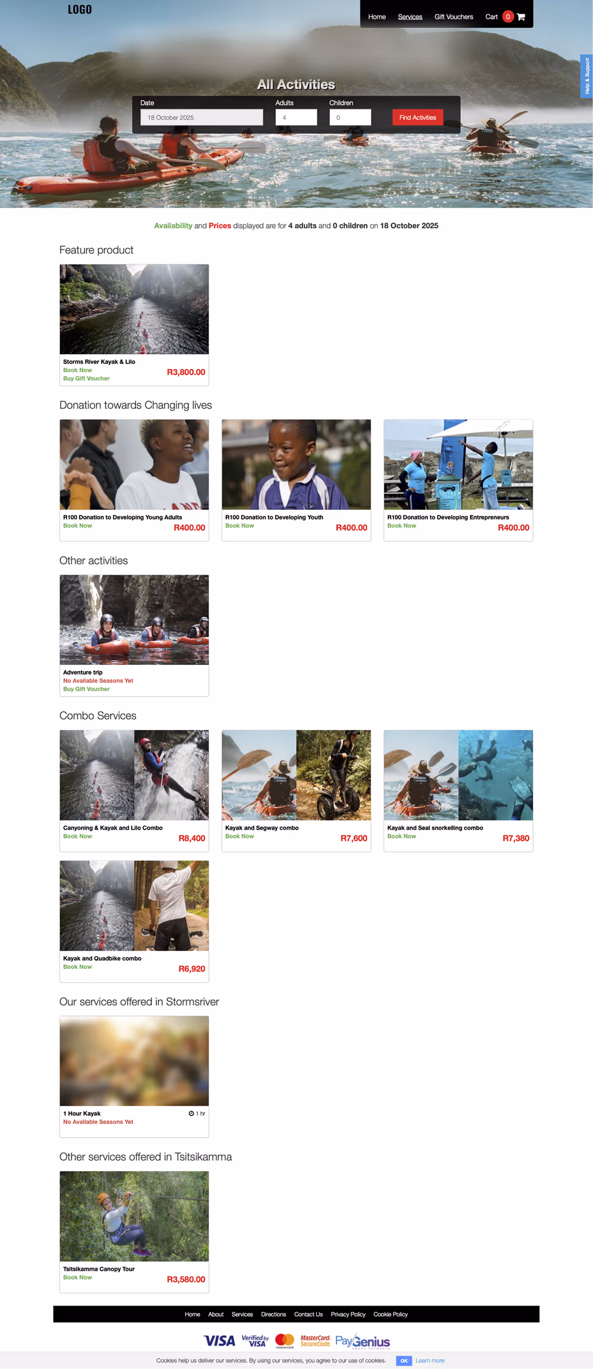
Activities were displayed alongside donation campaigns and unavailable activities, making it confusing for users to find bookable experiences.
The existing booking flow included unnecessary steps leading to confusion and booking abandonment.
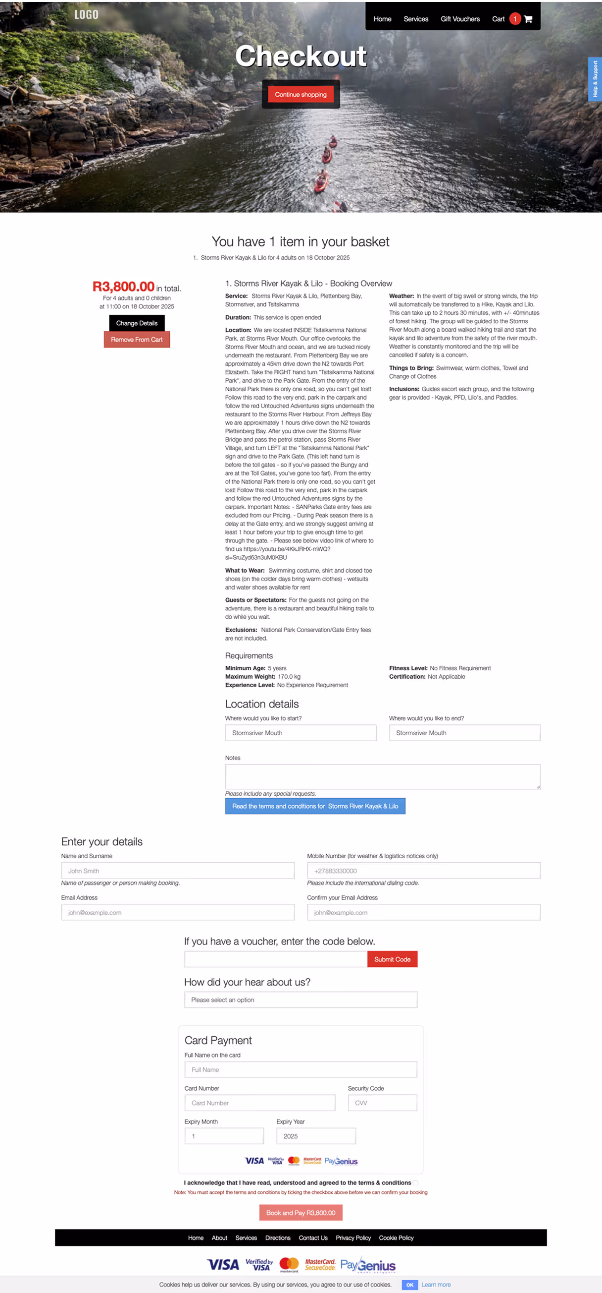
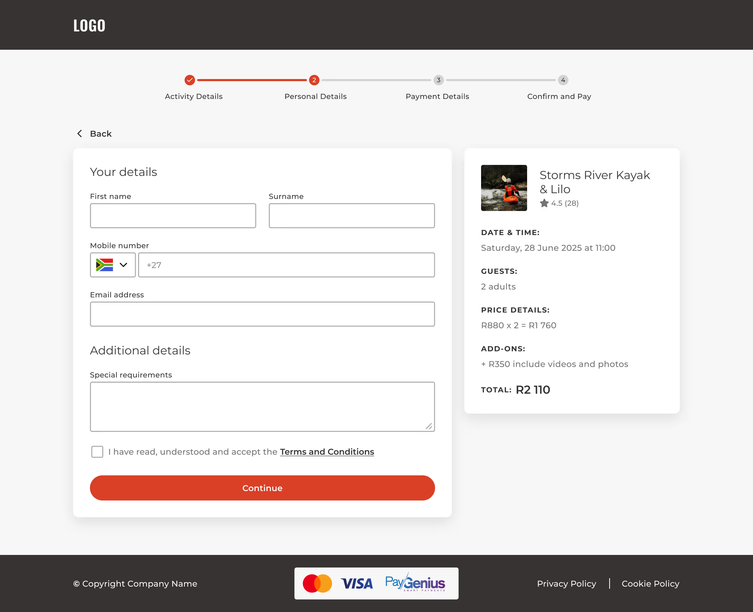
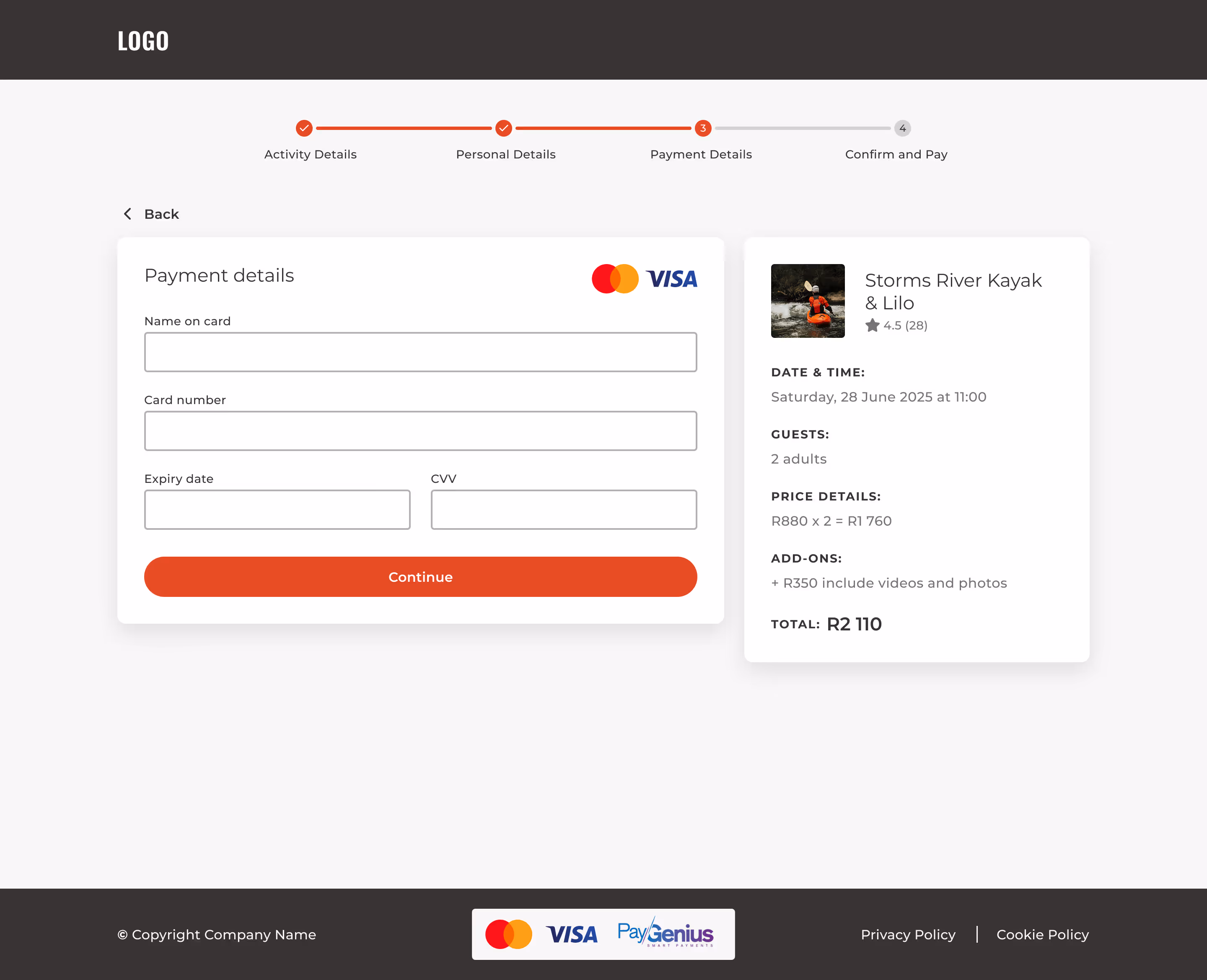
The checkout process placed all information (personal details, payment, confirmations) on a single page, creating cognitive overload and increasing the risk of errors.
To address these challenges and streamline the experience, I:
Introduced logical categorisation separating bookable activities, donation campaigns, and upcoming activities, enabling users to quickly find what they’re looking for.
Removed redundant steps to create a shorter, more direct booking process to reduce confusion and improve completion rates.
Redesigned the checkout as a clear, step-by-step process, grouping related information together (e.g., personal details, payment info, confirmation). This helps users focus on one task at a time and feel confident about their input.